
Project Overview:
Aroma is a perfume brand shaped by the calm strength and raw beauty of tropical rainforests. Each scent in the line tells its own story, with Indonesian names that match its roots and mood. The project covered the full brand identity, bottle design, and packaging for a small but standout fragrance collection.
Objective:
The goal was to create a brand that feels sincere and well-considered. The design had to stay simple without being dull, and artistic without feeling out of reach. Visually, it needed to capture the emotion behind each scent while keeping a clean, modern look.
Challenges:
The challenge was turning the depth of each scent into visuals without using clichés or going over the top. Using Indonesian names gave the brand character, but the design had to make those names feel clear and relatable for a global audience.
Design Process:
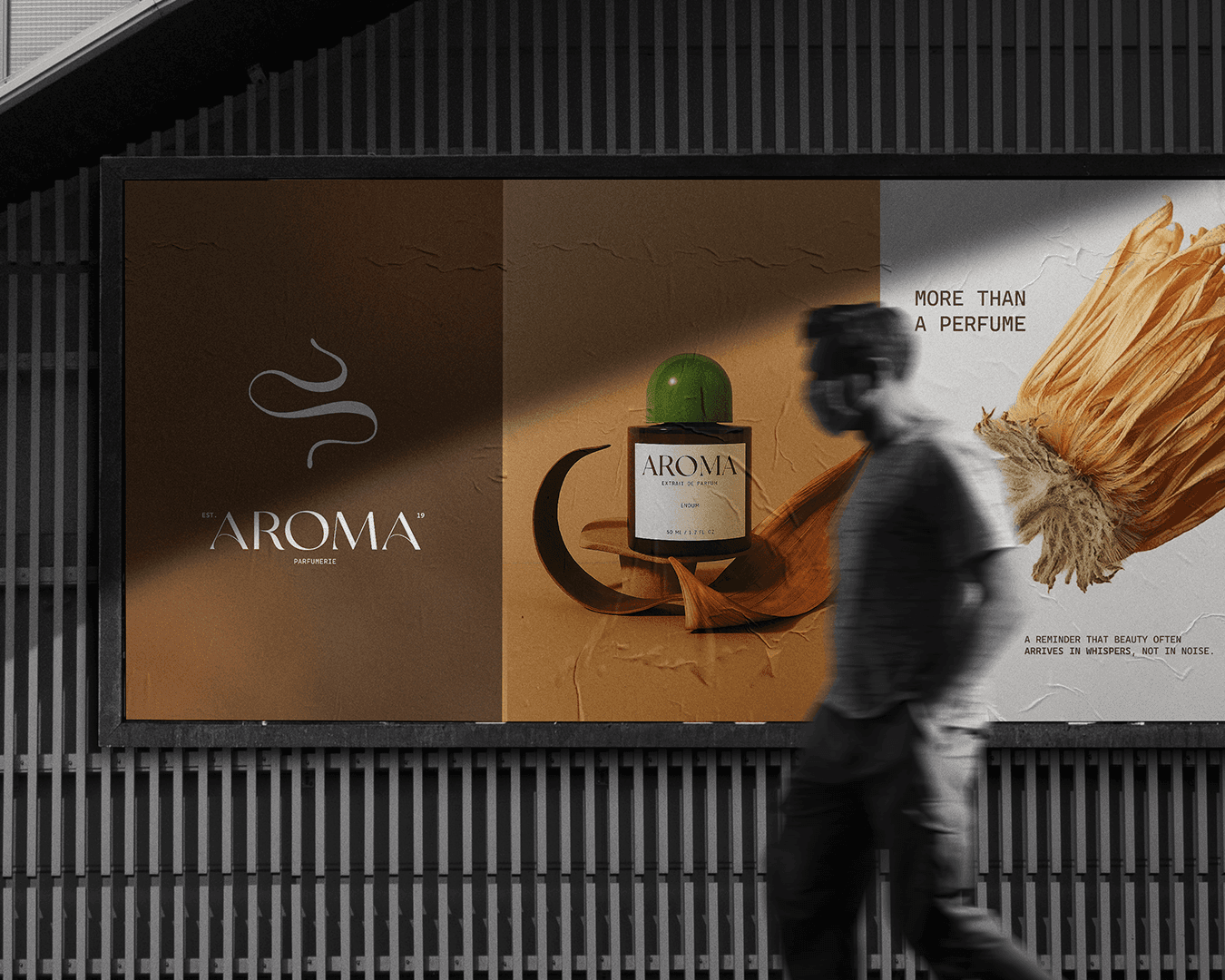
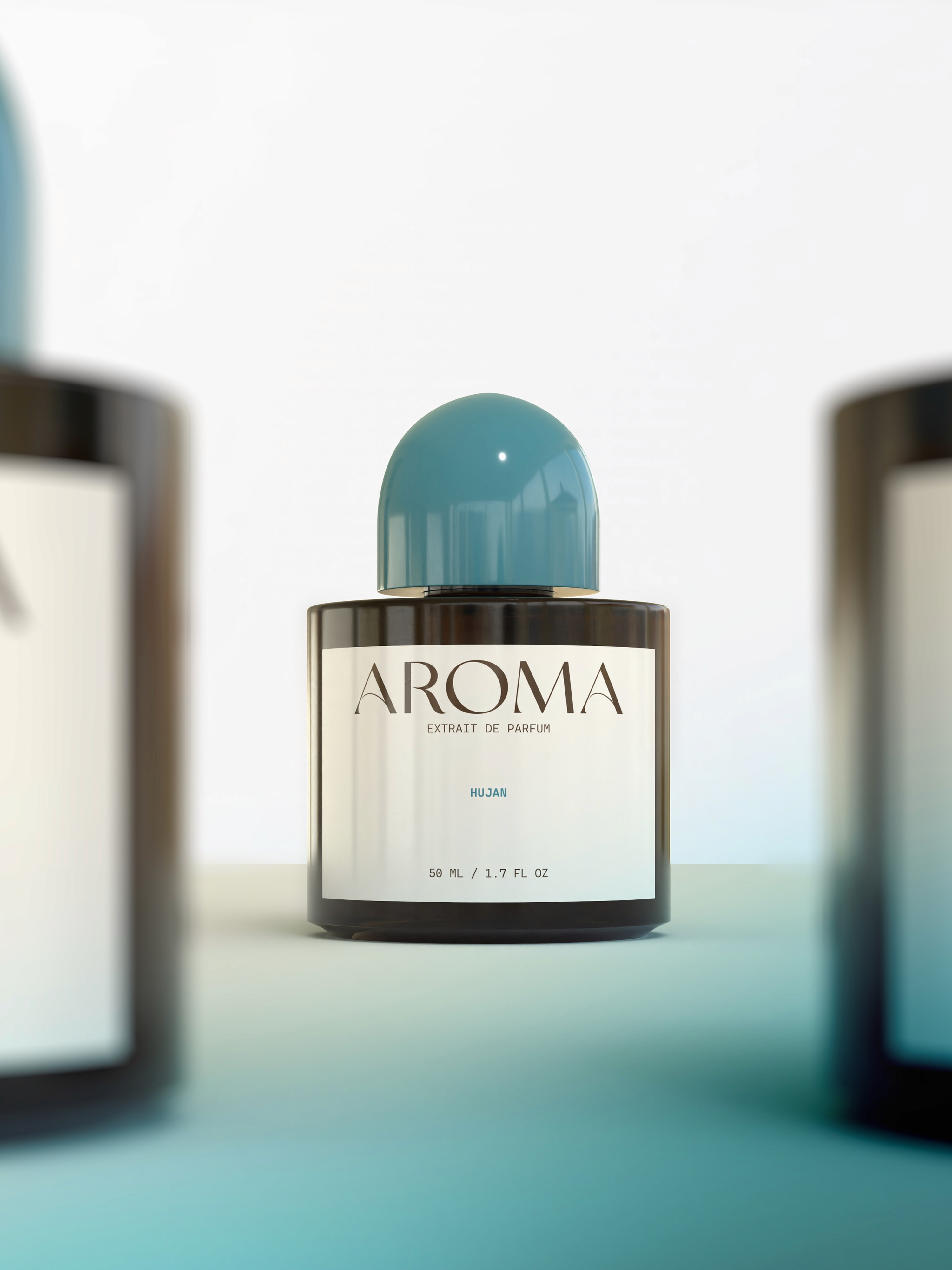
The idea started with scent as something that moves softly through space. A flowing symbol was designed to show the path of fragrance in the air. The logo uses a gentle serif typeface with a bit of personality, keeping it warm and approachable. The main color, a deep earthy brown, keeps the look calm and grounded.
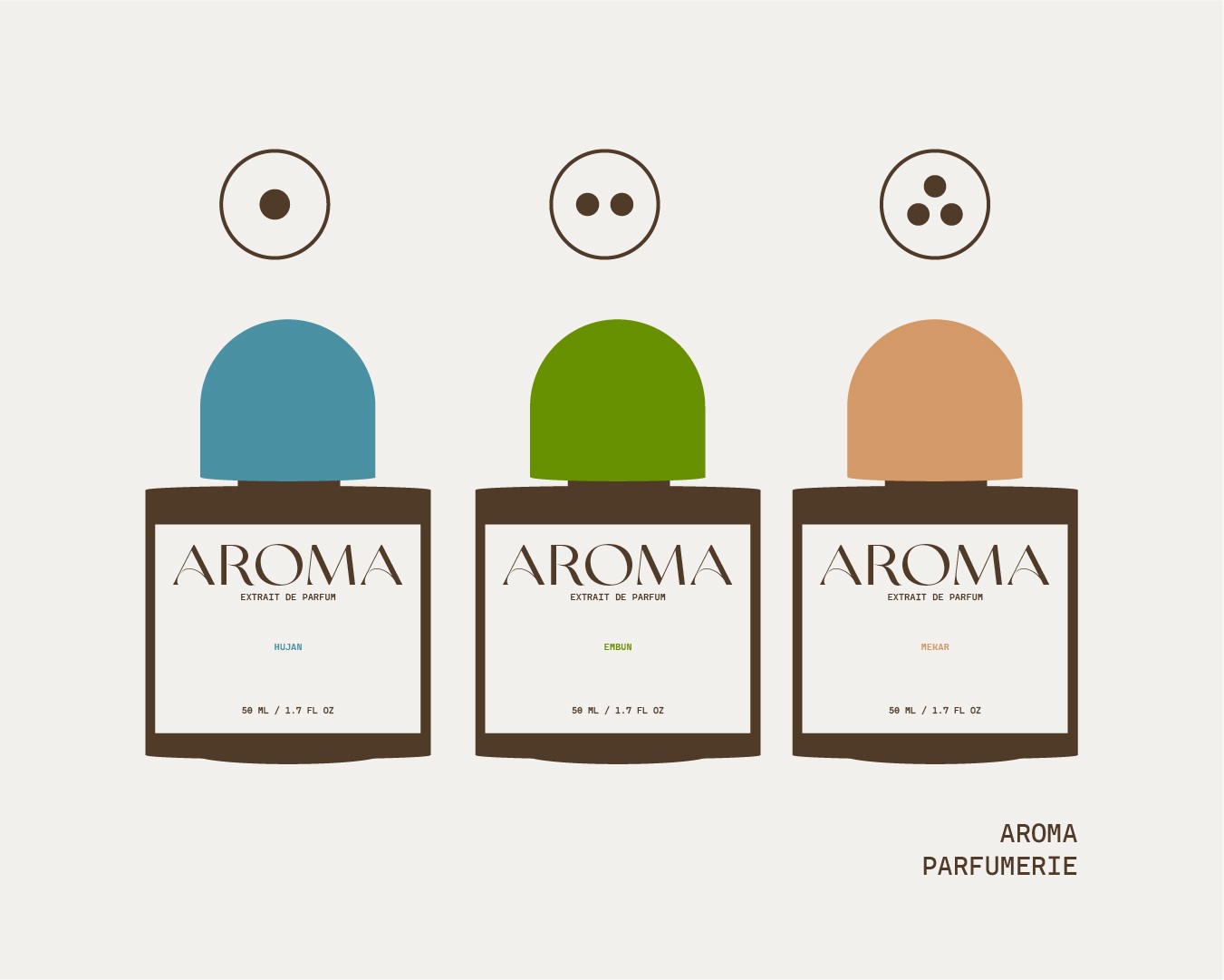
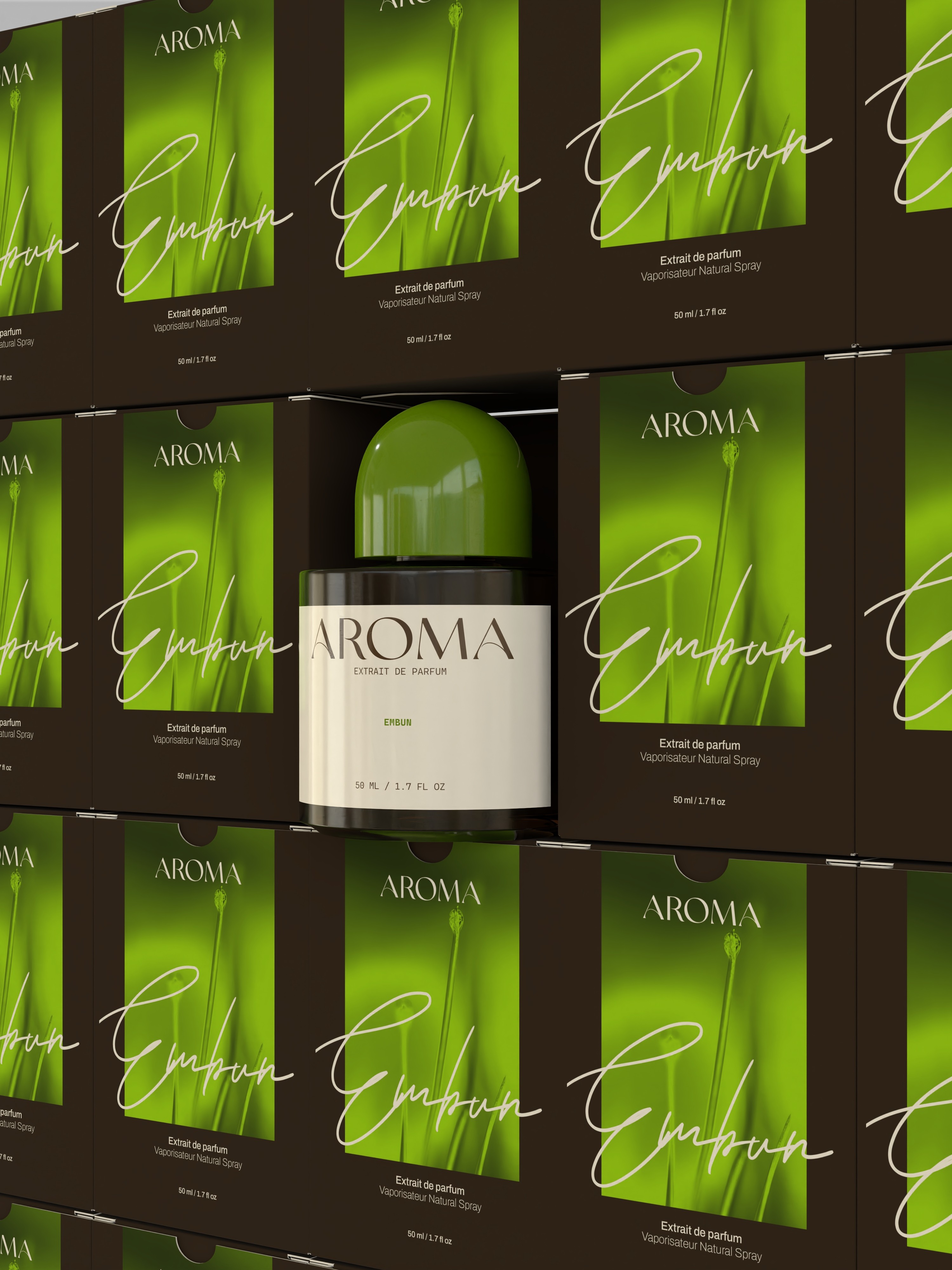
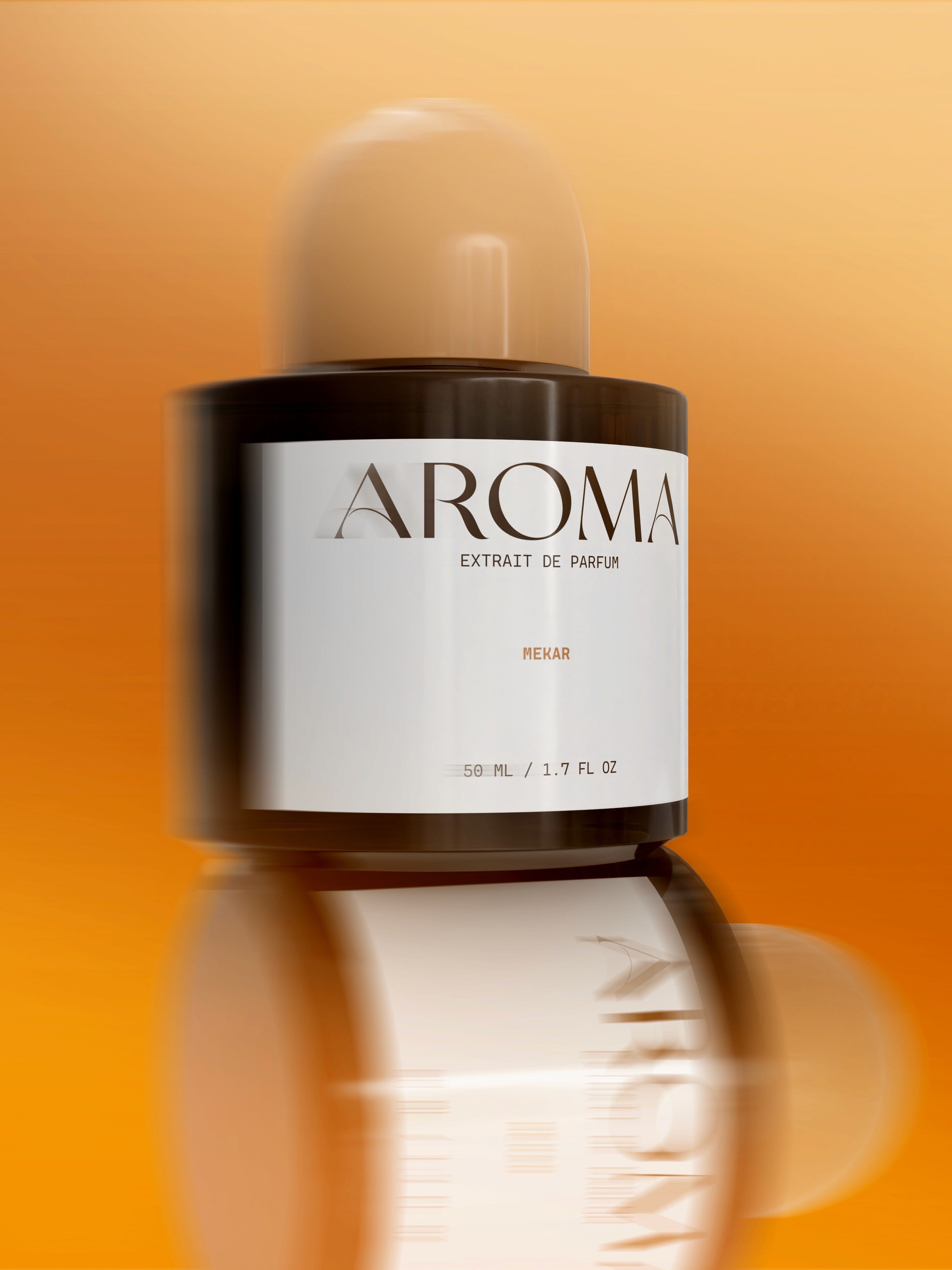
Each perfume has a cap color that matches its name and feeling. Embun is green for morning dew. Hujan is blue for rain. Mekar is warm peach, like blooming flowers. These colors carry through to the bottles and packaging, making each scent easy to tell apart while staying within the same visual system.
Outcome:
The final result is a brand that feels grounded and easy to understand. Shapes stay simple. Colors stay consistent. The design gives space for the scents to stand out on their own. Aroma comes across as a quiet brand that pays attention to the senses and the little things.
Key Achievements:
Aroma creates a full experience by keeping things simple. The design backs up the product without trying to steal the show. It’s a clear example of how thoughtful branding can add meaning without needing to shout.